
Federal Tax Visualization
I came across this very neat online tool from engaging-data dot com to visualize Federal taxes owed. As you play with the inputs, you can very easily see the dramatic differences in tax between income from LTCG and qualified dividends (in blue) versus ordinary income and unqualified dividends (in green).
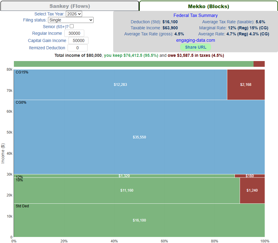
In the snapshot below, a single filer in 2026 has income of $80K yet pays only $3,587 in Federal tax (in red)—a 4.5% effective tax rate.
Join the conversation
Sign up to reply, follow discussions, and connect with the ChooseFI community.
Comments
I was just telling my husband on a walk the other day, "It would be so cool if someone created a tool that showed you visually, like filling up a bucket, where you landed with taxes." Thanks for sharing!
Thanks for sharing, pretty cool to see the visualization!
Interesting to see this. I’m starting to learn more about taxes thanks for sharing